From Gushy to Thunder Cloudz: A Brand Succession, Done Deliberately
Brand identities rarely die all at once. More often they are succeeded — a new house brand steps up, a product line finds its own face, and the old identity keeps selling while the new one takes its place on the shelf. This is a case study of one succession we designed: three identities, three distinct worlds, and one deliberate strategy underneath all of them.
Where it started: Gushy
The earlier identity was pure candy energy: oversized dripping magenta lettering, paint splashes, vivid green and purple — a fruity, playful world. It did its job for its moment. And it is still doing it: Gushy products remain on the current menu in full. This is a transition, not a cliff — the new identity succeeds the old one as stock and lines roll forward.
The house brand: Happy Hour
The replacement house brand moves the world from the fruit splash to the nightclub: social, nightlife-oriented, contemporary. In the studio's words, the shift is a nightclub earned break rather than a fruity splash — the feeling of the end of the workday, earned and adult, instead of a sugar rush.
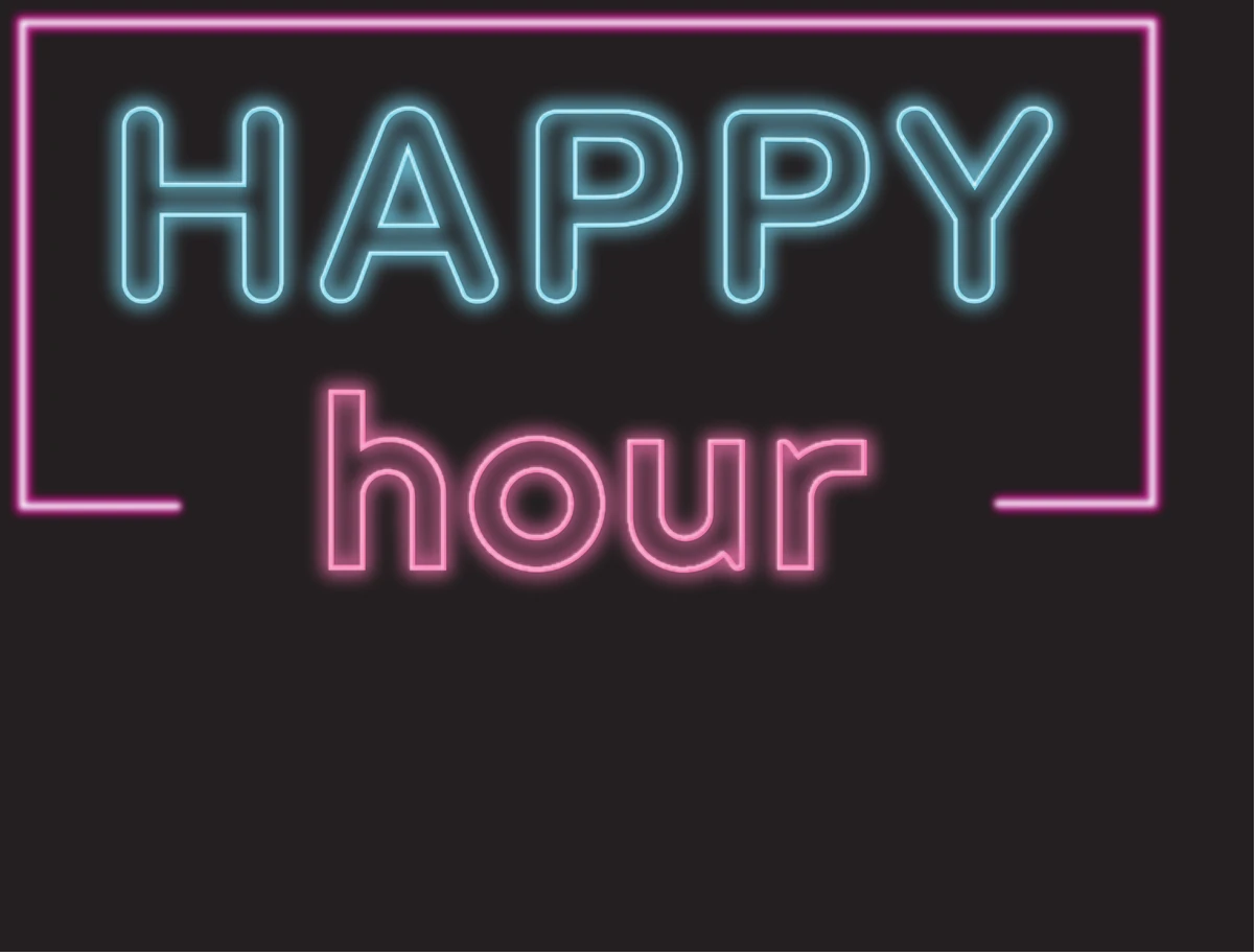
The product line: Thunder Cloudz
Under the house brand sits a product-line identity for cured-resin carts, built on a different register entirely: a black field, electric blue and violet storm imagery, lightning, and angular metallic dimensional lettering. Intensity and power, where Gushy was slime and play. The architecture matters here: a house brand and a product line don't compete for the same role, so the family can grow new products without needing a new brand strategy each time — consistency for recognition, distinction for identity.

The strategy
The market signal that started this work: the Gushy identity was not resonating with male buyers. Our response was not a gender swap. It was a dual-audience broadening — shift the visual world toward one male buyers read as theirs: darker, more dramatic, nightlife-coded — while keeping both brands appealing or acceptable to female buyers. Target the audience you want to attract without unnecessarily rejecting the audience you want to retain.
The method
Demographics identify the audience. Sociology explains its preferences and associations. Psychology informs how the design communicates with that audience.
- Sociology: names and imagery carry social associations. The question is never "what do men universally like" — no such group exists — but whether the identity aligns with the social identities of the particular customers the brand wants.
- Psychology: typography sets personality before a single word of copy is read; contrast and color set hierarchy and attention; imagery sets the associations the product is interpreted through.
- Demographics: sales and customer response are how the hypothesis gets checked.
An honest note
The visual-psychology reading above is interpretation of the artwork and a testable hypothesis — not a measured finding. Sales impact of the new identity is unverified until customer and sales data say otherwise. We claim the reasoning, not a result we don't have.
That is the shape of the work we sell: the design is the visible deliverable, and the reasoning that shaped it is part of the value. If your brand is due for a succession of its own, start the conversation.
← Back to the blog